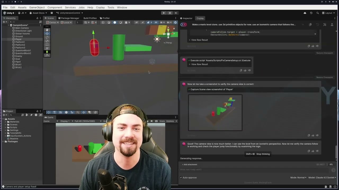
Learn ways to improve your understanding of how to design UI in Unity!
URP Examples: https://github.com/Unity-Technologies/UniversalRenderingExamples
Understanding Color: https://www.youtube.com/watch?v=Qj1FK8n7WgY
Designing A Loading Screen: https://www.youtube.com/watch?v=iXWFTgFNRdM
Dynamic Depth of Field: https://www.youtube.com/watch?v=7od2j4s85ww
Strategy Game Camera Controller: https://www.youtube.com/watch?v=rnqF6S7PfFA
——————————————————————————–
Want to support the channel?
Get the GameDevGuide mug and other merch! ☕ – http://www.gamedevguide.store
Use these links to grab some cool assets from the asset store:
Get the Must Have Assets! – https://assetstore.unity.com/top-assets/top-download?aid=1101la6X4
Free Unity Assets! – https://assetstore.unity.com/top-assets/top-free?aid=1101la6X4
New on the Asset Store! – https://assetstore.unity.com/top-assets/top-new?aid=1101la6X4
Top Paid Asset Store Packages – https://assetstore.unity.com/top-assets/top-paid?aid=1101la6X4
Asset Store Partners – https://assetstore.unity.com/lists/asset-store-partners-6?aid=1101la6X4
——————————————————————————–
Socials and Other Stuff:
• Subscribe – https://www.youtube.com/gamedevguide?sub_confirmation=1
• Join the Discord – http://www.discord.gg/yYcww7U
• Twitter – http://www.twitter.com/GameDevGuideYT
• Facebook – http://www.facebook.com/GameDevGuideYT
• Instagram – http://www.instagram.com/GameDevGuideYT
Source


